Friday 14 January 2011

HOW DID YOU USE MEDIA TECHNOLOGIES IN THE CONSTRUCTION AND RESEARCH, PLANNING AND EVALUATION STAGES?

During my research sector of the project, I used Youtube as an online trailer library and embedded my case study trailers into my posts and analysed them. By doing this, it automatically becomes easier for the examiners to follow my study and understand my opinion more clearly. Another tool that I used was the Internet Movie Database (commonly known as IMDB) to find out more about the films that I focused on and to really understand the outlook of the film and the directors vision before I could use it as inspiration. In retrospect, using IMDB helped because I was able to show my homage to the films in the trailer more clearly because of how IMDB helped me gain a greater understnding of the films context and its development.

The editing stage of film production is the most gruelling part of the process. But for our trailer to be the best it could possibly be, my group and I would have to work hard.

The first stage of the editing process was to select useable footage. To help us do this, we used iMovie's scanning tool which follows the mouse movements over a clip and plays through the clip to preview its content. This made it easier for our group because it helped us go through things quicker without having to select and play each clip. We also used a wide range of different media editing tools and video software in the editing process. These range from Adobe Photoshop, to iMovie, to video converting programs.

iMovie was the definitive tool and the main source of editing in this project because it is the most reliable video editing software on the market. It has an automatic memory drive and does not require the user to manually save their project as the program does it for you.

Photoshop was used to create the media poster and the website interface (which I will talk about later). The poster is pretty much a layer cake as it has had endless amounts of tweaking and layers of different elements added to it. We used the burn tool, slice tool, dodge tool, the marquee tool, the magic wand, the polygonal lasso tool; we duplicated layers, we made layer masks and vectors. We used adjustment fill layers and several other adjustment tools to create our desired poster style.

We actually designed our website page on photoshop and inserted it into Macromedia Dreamveaver MX and left it as that. Reason being, the style we wanted was not anything that Dreamweaver can operate so we decided to be smart about it and used our inspiration by Black Swans website and made it very similar to our poster. If we could choose any program to have built our site on, it would have been Adobe Flash Professional because we wanted an interactive or non-static website that would catch the viewers eye.

Our group used a HD camera for some of our shots and when we were ready to upload them to iMovie, the program could not recognize us; this sent us on a one week hunt to get the video clips converted. I took the clips home and found a program online and used it to convert our clips from MP4 to AVI.


Overall, my group kept our technology use very closed and basic but concentrated our efforts on using advanced tools on the programs because I personally see no point in using one hundred programs to try difficult things when you can use one program to do one hundred impressive things.

HOW EFFECTIVE IS THE COMBINATION OF YOUR MAIN PRODUCT AND ANCILLARY TEXTS?


WHAT HAVE YOU LEARNED FROM YOUR AUDIENCE FEEDBACK?


Facebook


Audience feedback is a very important attribute to the progress of a project. With the responses from the audience, you can make your product the best it can be based on what they have requested or pointed out. In the case of our Horror trailer, I think that we have been given good feedback and helped us realise what was good and what needed improvement. Most of all, we have learnt that our trailer conveys a very unusual horror film style and is successful in taking the viewer out of its comfort zone.

IN WHAT WAYS DOES YOUR MEDIA PRODUCT USE, DEVELOP OR CHALLENGE FORMS AND CONVENTIONS OF REAL MEDIA PRODUCTS?

In todays cinema, producers are pumping out big budget horror films that are filled with all the conventions of a horror film twisted and turned into their own rendition of a horror film. But if you look back at the Horror film industry from 30 years ago, all the typical conventions of a horror film were included somehow in the films plot and style. These often included a young, naive female character, a possessed child and a suspicious mature character. But what happened when an older film challenged the forms and conventions of the genre?

The Shining was released in 1980 and was a 'breath of fresh air' to the Horror industry. It brought a new outlook on how far you can branch out of the predictable style of horror movies to aspiring film directors and birthed the new 'Ultimate Horror' also known as 'Psychological horror films'.


In The Shining, male gaze was used to make Jack (Jack Nicholson) seem as vulnerable as the coinciding female character when. When Jack walks into the bathroom he sees a beautiful woman in the bath, he is left in awe of the female.  Whilst Jack stands there phased out in mind, body and soul, the bathing female is in control of him because he is giving in to her advances. Female characters are usually the ones used in a male gaze sequence. But the Director Stanley Kubrick was able to challenge the conventions of horror cinema and reverse the roles.

In our horror film trailer we have used the same method. My group & I challenged the conventions of real horror movies and purposely turned the male gaze into a rough view of the female characters rage. The female character was more powerful and dominant whilst the supporting male character appears weak and helpless in comparison. This works for our movie because it helps express the female characters harsh emotions and unprovoked anger against the male. Also, we were able to convey a metaphorical view of the male characters vulnerability and how defensless he appears.

POST STILL OF PAUL RUNNING.
POST STILL OF THE MAN

By using the male gaze as a tool against the male character, We were able to develop its original use so that the male is inferior to the female character.

Another aspect that we challenged was how the viewer  reacts when watching the media product. Traditionally, horror films are designed to make the viewer uncomfortable and make you feel distant from your comfort zone. For example, The Shining features many disturbing images that does would not  make the viewer feel comfortable whilst watching. But my group & I wanted to draw the viewers in and make them want to know what is about to happen next; without using the 'fear factor' of wanting to crawl out of your seat.

By using the art of storytelling in a less shocking way, we were able to challenge the typical gorey identity of horror cinema.

Making The Poster

The film poster is part of the advertisement strategy used in a film campaign. It is visually eye-catching and grabs a viewers attention whilst they are going about their daily business; which is a way of mass exposure of a film.

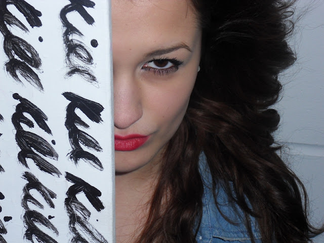
The idea behind our horror film poster is one that will appeal to a viewer who is interested in more 'out of the box' horror convention. Our idea will have to somehow integrate the canvas, the paint and the red lipstick. Taking this into account, we went ahead with shooting the pictures for the photograph. These are a select few of the best ones.


Through process of elimination., we finally chose our favourite photo to work with.


What can we do with it? Well, I would like to play around with the colour channels and the luminance so that the painter seems more 'unlife-like'. So once I had taken this image on to Photoshop and played around with it, this was the end result.


What I like about this poster is that it looks intense. I used the burning tool to define her jawline and her eyebrow bone. I used the dodge tool to make her lips look more glossy and deeper in colour. I used the sponge tool to desaturate her skin colour in most areas. I used an overlaying blending option to give texture to the canvas.

Final Cut: "That's a wrap!"

This is the final cut of the teaser trailer we made!


The Editing Process

Once we had finished the production side of things, we went on to upload the footage on to iMovie to start the editing process. At first, we briefly experimented with cropping the shots and trimming the clips for our chosen scenes. During this process, my group and I kept disagreeing on what shots were useful and what shots were not. We came to an agreement by all choosing our favourite few shots and then using the process of elimination until we were all satisfied with the best shots.

The next step was adding the music. This was, I must say, the most grueling part of the editing process. The end product can turn out to be not quite what you aimed for if you choose the wrong music for the trailer. The two other members of my group found the song that would become our chosen music for the trailer on Youtube and we extracted the mp3 audio and altered it to fit to our trailer.

Finally, the last step on iMovie was adding the text. When adding the text we had to make sure that we had fonts that would work well with the phrases in between the shots. We needed a font that would help link the trailer to the tagline without the viewer knowing the films title yet. We searched on www.dafont.com for a suitable font to use for the trailer. We tried italic, old english, calligraphy, arial and bold fonts but none of them worked well. We settled for a text called 'WC Mano Negra Bta' which was very chilling and fit in really well with the trailer theme.

The last thing to do was to export it on to the desktop as a movie file and upload it to Youtube.

The Storyboard


Sunday 9 January 2011

Props-What props?


Props are a major part of the film-making process. Whether it be the character's weapon, the disturbing furniture or a pin on the floor, every single prop has a purpose and importance in a film because nothing is there by accident.

In our teaser trailer, we have endless props ranging from white canvases plastered with the word "kill" in red paint,

In the trailer (and the project in general), we have decided to have a recurring red theme. The red idea makes a lot of sense and links every part of the films' life together. From the red lipstick that the painter wears throughout the film, to the red paint that she paints the work 'kill' with.

The Script

The Teaser trailer was originally supposed to include a short conversation in the symmetrical front garden of the Painter. The conversation would have gone a little like this:


A Conversation between Painter and visitor.
Location: Front Garden
Time: Late Evening

Visitor: You’ve got a very nice house… did you … did you decorate it yourself?
Painter: [A blank stare into the visitors eyes]
Visitor: [nervous laugh] Sorry… I’m a bit nervous… I don’t usually do this. Can I have another drink? *Vigorously finishes his drink all at once*
Painter: *Gets out of seat and walks off screen*

We chose to take it out of the film because it will slow down the fast paced narrative and tempo of the trailer. However we did keep the awkward stares between the painter and the visitor. This is because it helps the viewer to understand that there is an extremely uncomfortable mood in the scene.

When We Chose To Film

At this point of the project we had our story, our narrative, our script and our location. Now it was time for the hard part (it is harder than you think)... the timetable!

As a team, we needed to somehow work around the fact that everybody has such differing personal timetables and it will be awkward timings for us to meet and film. Hannah and Layla both have the hours off college where as my hours off do not match up to theirs; which evidently means we could not shoot during college hours outside of lesson time. We could not shoot on weekends because I work both Saturday and Sunday. So creating a timetable really was a tough process.

These were a breakdown of what scenes we shot on which days:

Day 1: The Painters House

  • The model turns up at the door
  • The model and the painter sitting across from each other, drinking
Day 2: The Pergola
  • The painter paints the model in a symmetrical shot
Day 3: The Pergola
  • The great chase (A montage of shots of the painter hunting the model)

Film Location

With the location, we considered shooting it in the Parliament Hill School art department, Parliament Hill Fields and even a cottage outside London! But one member of the team remembered a pergola she had visited a while back in Golders Hill, North London. She insisted we had a look at the location. So off to Golders Hill we went!


After having a look at Golders Hill, I think it is safe to say that everyone in our group fell in love. And we fell in love with the scenery every time we went back there! Why did we choose this location in Golders Hill? Well, we chose it because it absolutely fit the criteria for what we wanted. It was symmetrical (which goes hand in hand with our idea of symmetry; paying homage to The Shining) and it exudes just the right amount of 'life' from its scenery that we need. Let me elaborate.

Our teaser trailer was a dark, dull, mysterious idea in the making. The three of us imagined it to be set in a grand estate; somewhere spacious and well designed. So when we came across this location it was perfect. We would not have been able to of used it if all the green life was freshly planted, alive and healthy. It helped that the vines looked old, the trees were dull, the plants and flowers were limp. To sum up, it helped greatly that the Golders Hill Pergola was aged and a bit 'run-down'.

Film Narrative: So... It's About?

Coming up with a film idea to make a horror trailer for is harder than you would imagine. From the outside, you would assume all you have to do is find a girl, have her get chased by someone scary, and have her eventually get lost. Make the film. Voila! BUT... once you are faced with the actual task of making a horror trailer, there is so much more to it. As we are 'ameateur film makers' we will find it very hard to produce a predictable storyline and still have it scary. So, as we tried to work against the norm, my group & I came up with these two ideas to develop into a trailer.

Idea 1 

Setting:

-Children's playground on Hampstead heath.
Characters:
-A mother and child that the viewer is made to empathise with
-A creature of some sort that takes children
Narrative:
When playing in a rather deserted playground a child goes missing right before their mothers eyes. There is a constant chase of what makes these children disappear and who takes them throughout the trailer.
Ideas of possible shots:
-A swing moving on its own with diegetic sound of the scraping rusty metal moving back and forth.

Idea 2:
Setting:
-A woman's home and painting area.
Characters:
-A sexualised alluring female.
-A passive male figure.
Narrative:
A female painter allures male character's into her home to paint life drawings of them when in fact she is a serial killer.
Ideas of possible shots:
-An over the shoulder shot of her painting the male with a focus pull to show the males insignificance and the females power.


So, what's the film about? Well, my group & I decided to opt for the less obvious plot of a haunted house where the freaks come out at night and went for more of a 'I'm a psychopath so I'm going to kill you' route. We briefly came up with an idea of a young woman who was an artist and she has invited over a man to be her life drawing model. Whilst he is too busy being in complete awe of her, she is busy planning his murder behind the canvas. She goes on to somehow reveal her insanity and thus the mad mayhem begins.

One thing that we had to take into consideration was that this was a TEASER trailer rather than your average two to three minute trailer showing all the important bits of the film narrative. In a teaser trailer, the director only has one minute to two minutes to show the most thrilling, tongue-teasing bits of the film that will entice its audience from an early stage. That being said, we chose to base the teaser trailer around the life drawing and the chase.

Teaser Trailer - Planning

Prior to the coursework research. Layla and I conjured up a vague idea of what we wanted our trailer to be. We wanted to do a teaser trailer based around an idea about a young attractive girl who is addicted to killing her sexual partners. We would have gathered inspirations from films such as Teeth (2007) and Jennifer's Body (2009).
2007 film starring Jess Weixler
an Directed by Mitchell Lichtenstein
2009 film starring Megan Fox
and Amanda Seyfried


Why did we scrap this idea? We agreed that this idea was a little bit too complex to film at an amateur level.   We wouldn't be able to film it without it looking like we attempted to make a soft adult film. We wanted our teaser trailer to fall into the psychological horror genre. So, at this point we started brainstorming what we would like our film to include:
  • A leading lady
  • Symmetrical sets
  • A helpless male character
We used our focus films, The Shining (1980) and The Strangers (2008), to influence our teaser trailer idea.


And After a drilling session of brainstorming and planning, we came up with our final idea; the one that we would run with...

The film is based on a young woman who is an artist. She finds her comfort and fulfillment in doing still-life paintings of men. Somehow, these men always happen to find her irresistible. And somehow, she always finds a way of killing them.